Wahoo! Delwalt and Craftsman Deal Days. Tell me more!
Yes, Fleet Farm. “Serving the Upper Midwest since 1955 with quality merchandise you won’t find anywhere else. Full stop shop for everything your home needs. Pick up your order in store or curbside,” says Fleet Farm online. Everything Fleet Farm has online will be at the store. What a crazy idea!
At Fleet Farm, I’m usually in the automotive area. I get tires and oil changes there. My folks live in the country, and my Dad likes Fleet Farm gift cards for all occasions. He gets a lot of fishing and hunting gear there. I’ll confess that I’ve never set foot down the tool aisle. I was looking for barn door hardware there once, and that’s as close as I’ve gotten to tools.
I have a collection of neon green tools from Home Depot. They keep their tools behind cages and group them by type. Plus, navigating a full cart through tools at Home Depot is challenging. I’m sure they do that for security reasons. I am looking forward to exploring what Fleet Farm has to offer.
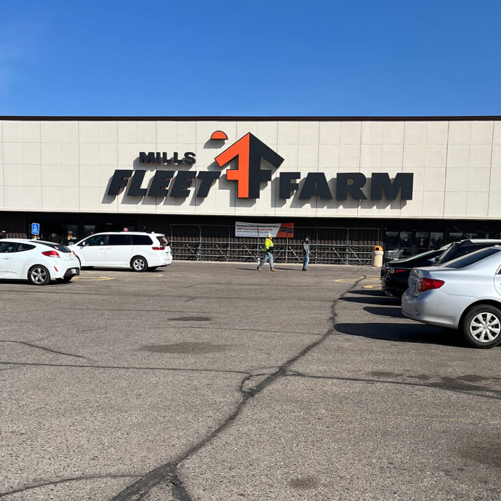
This is Fleet Farm. It’s a lot bigger than it looks. People get their cars fixed in there.
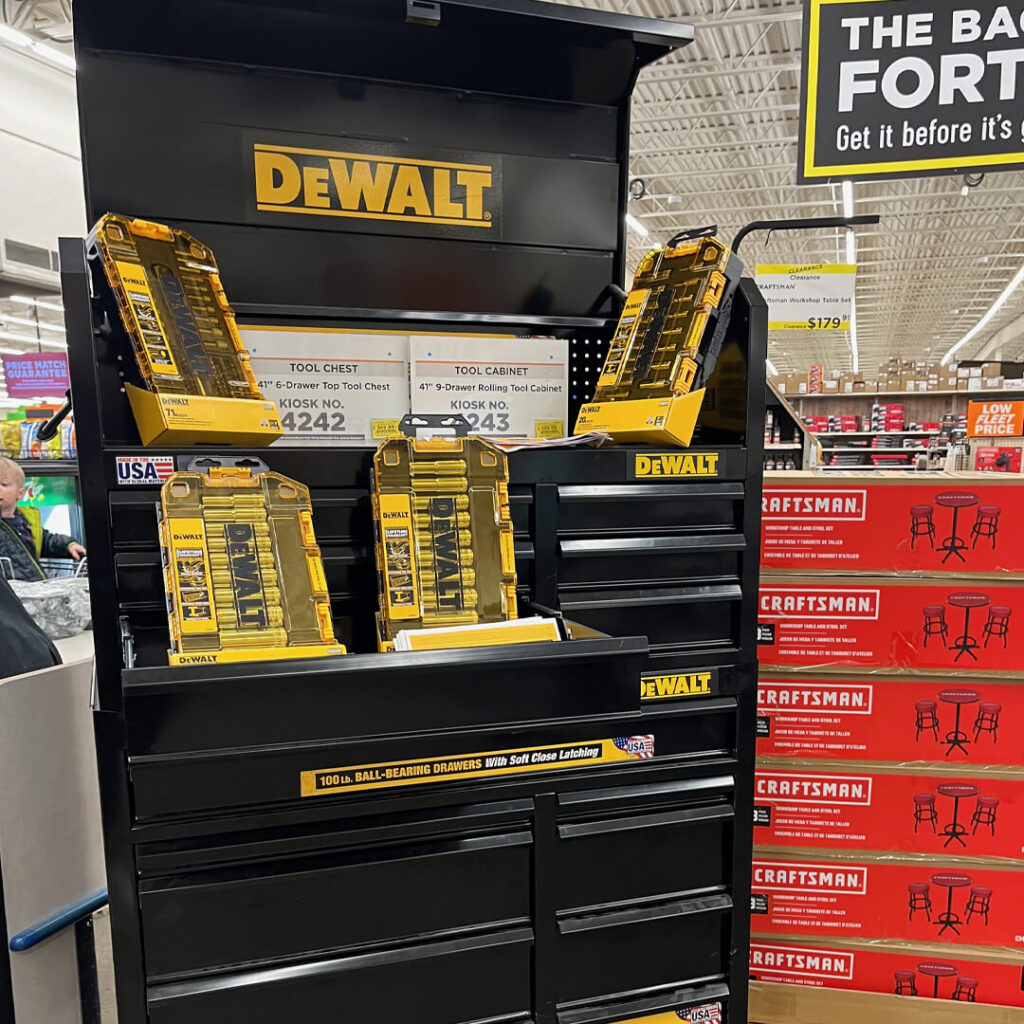
The Dewalt & Craftsman Deal Days are right inside the door. I love walking in and thinking, “Wow, there must be something going on here.”
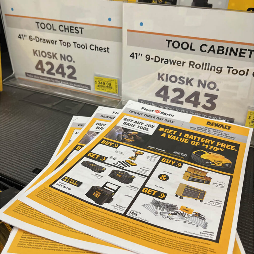
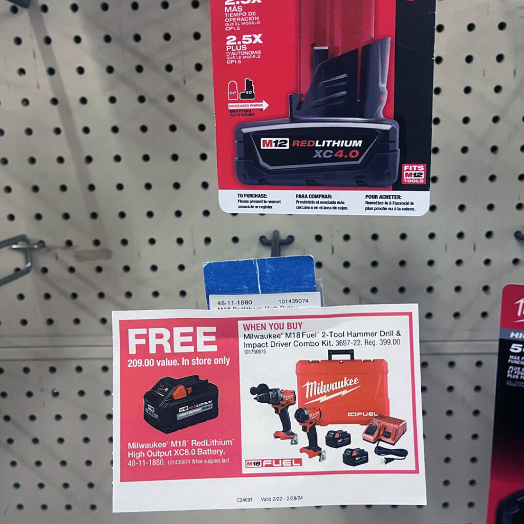
I also love printed paper fliers. Stacked them up. Hand them out. Take yours and see what kind of savings are ahead.
Stanley Black & Decker is the parent company of both DeWalt and Craftsman. You can’t walk eight feet at Fleet Farm without hitting one of their end caps. Playing the lead here: DeWalt.
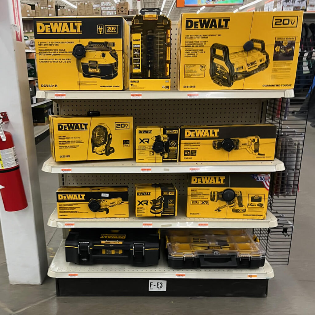
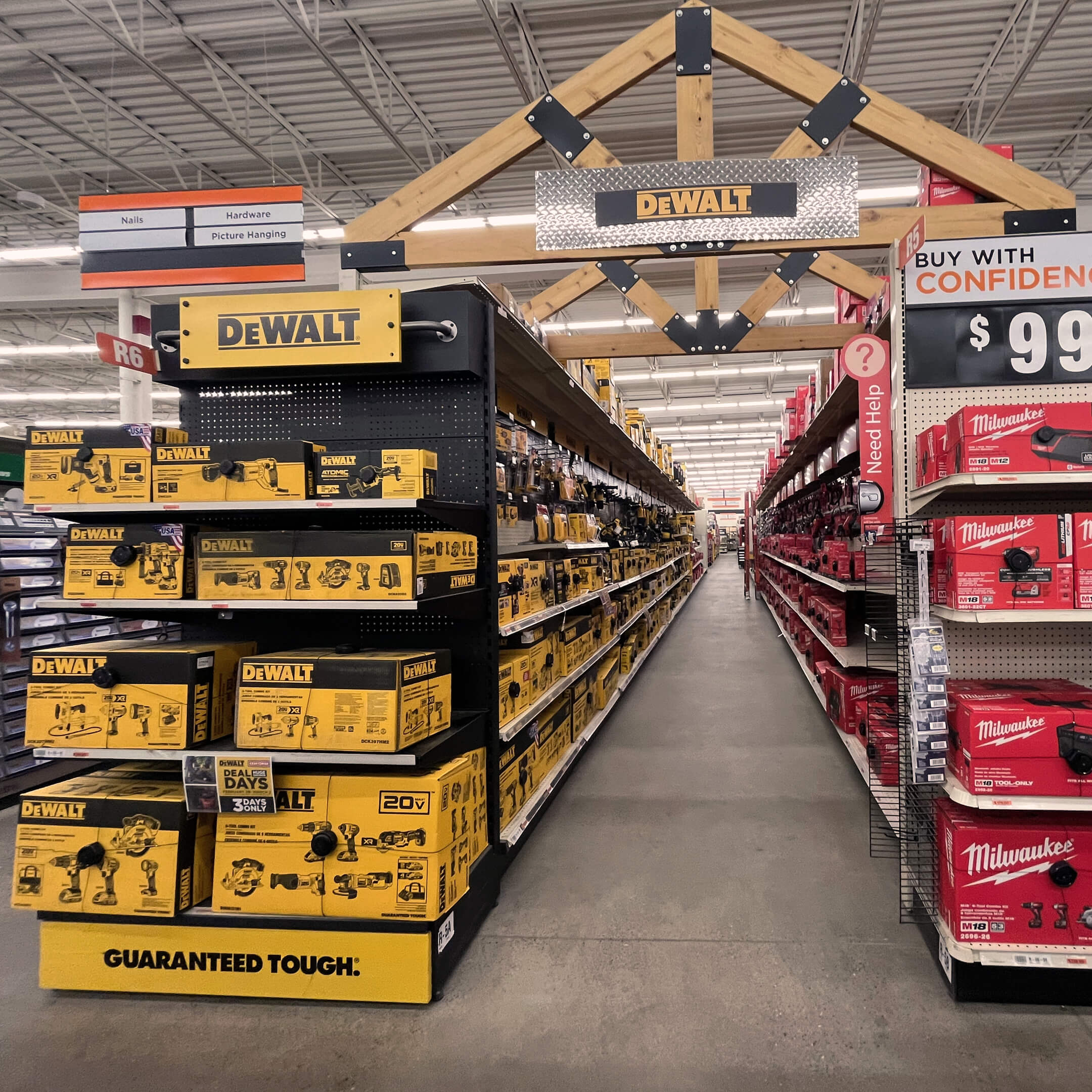
It’s incredible how an end cap can command attention when the product’s packaging is the primary merchandising. “Let’s just fill it with yellow boxes, someone will stop and look.” Success!
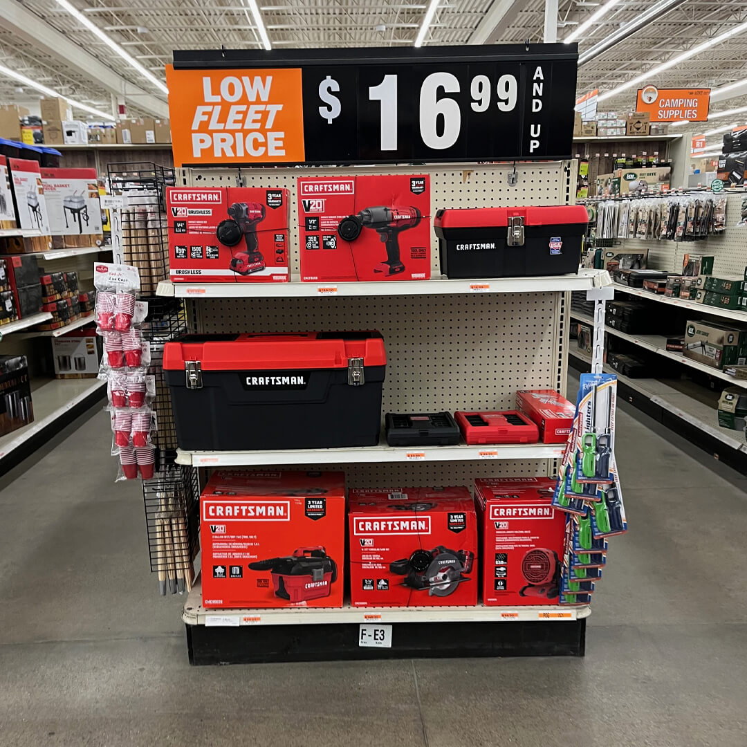
Or let’s try it in red! Now pay attention during this exercise. Sometimes the tool in the red box is Milwaukee rather than Craftsman.
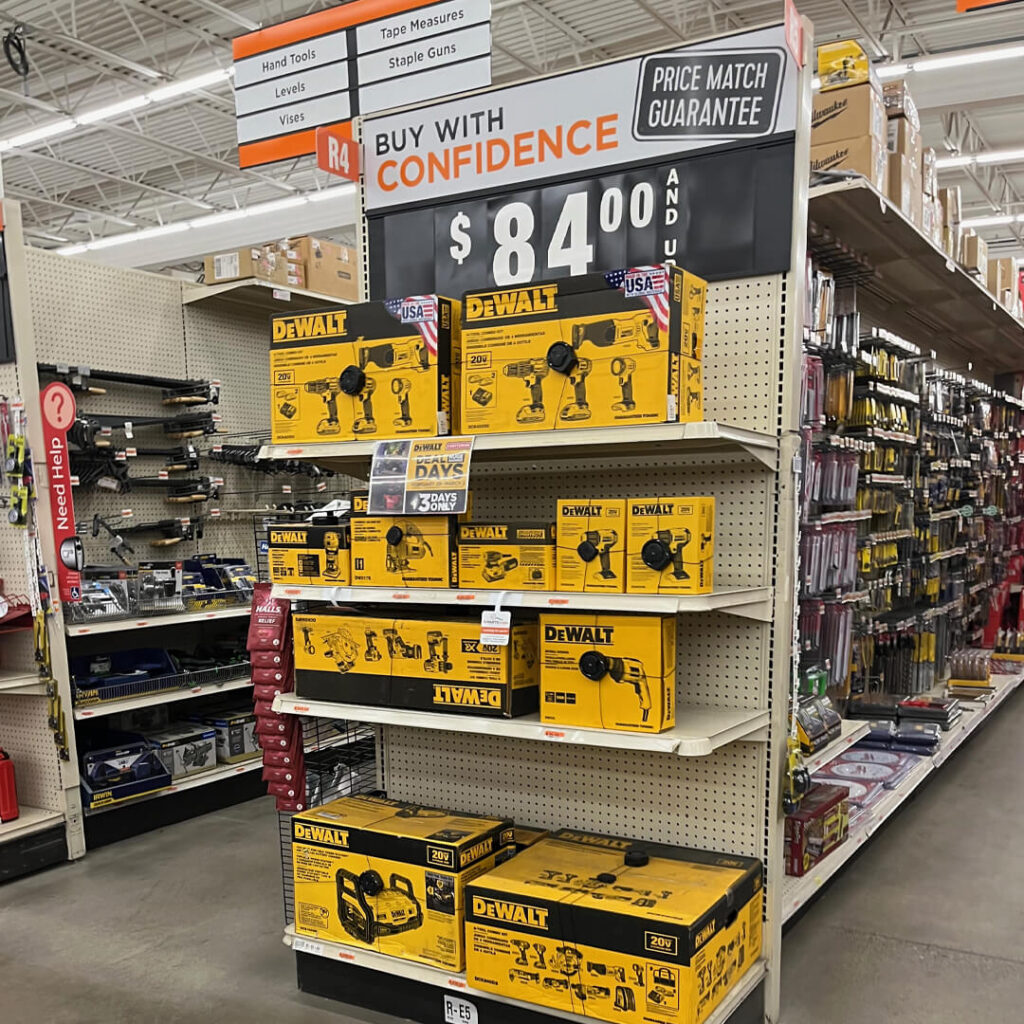
So, what’s the best color for the event sign? Yellow connects to the primary brand and even the parent brand. But has the context for the “Deal Days” sign been considered?
What an entrance to the tool aisle! This is the place for tools. Signposted with the store’s two hero brands.
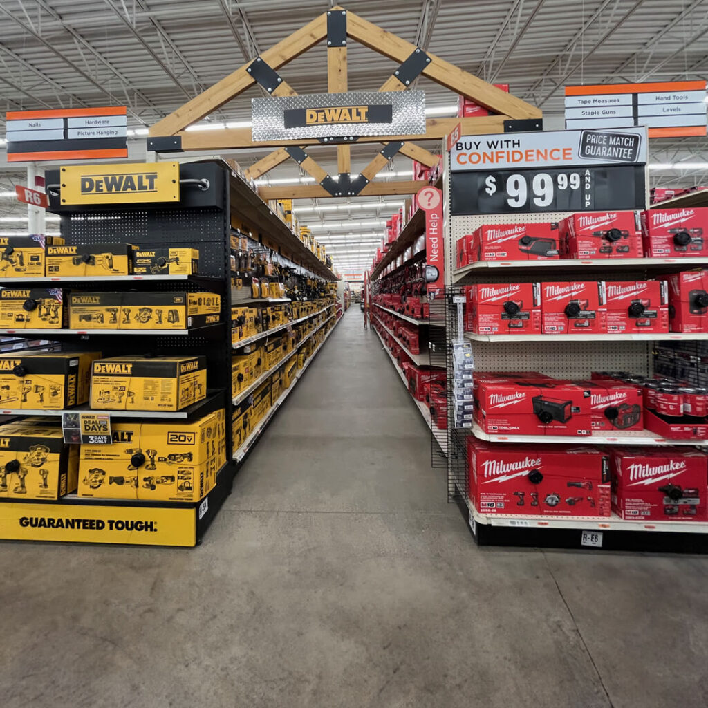
Did they build this topper at the store? Building displays at retailers with their resources seems so easy. But it’s not.
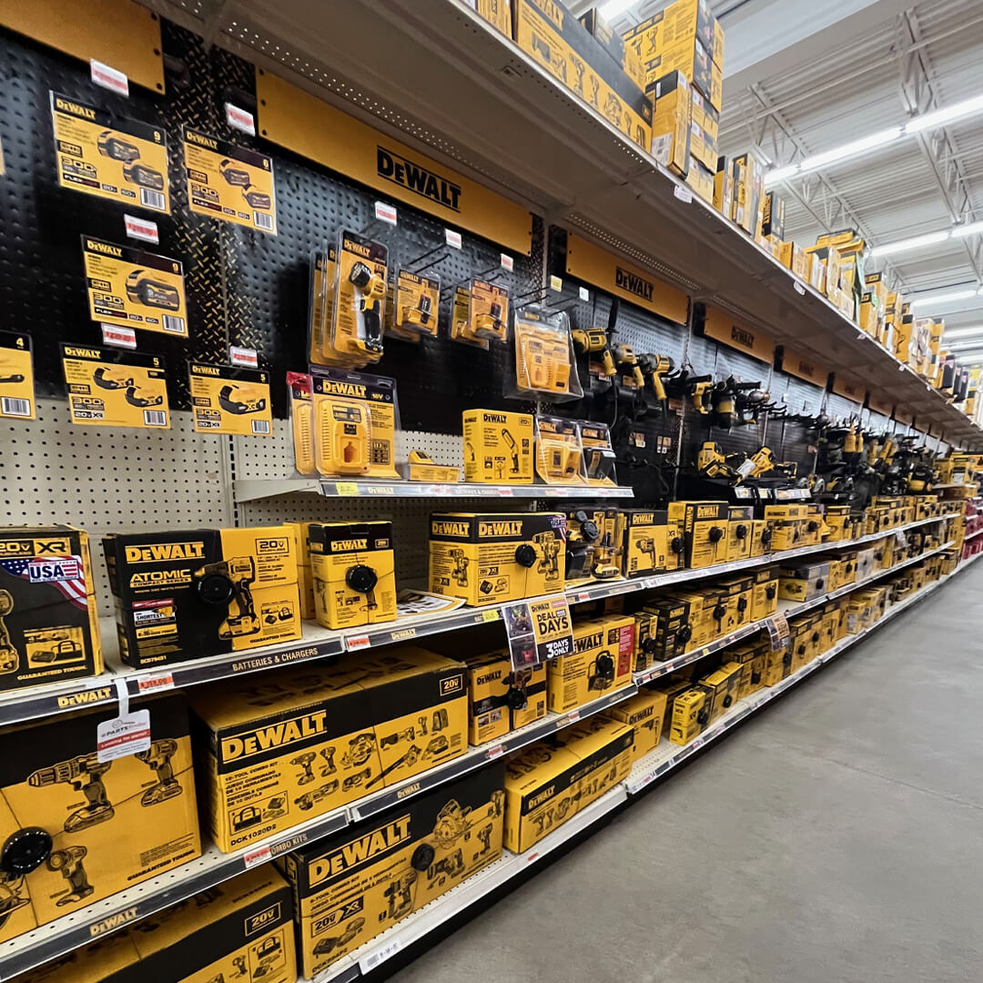
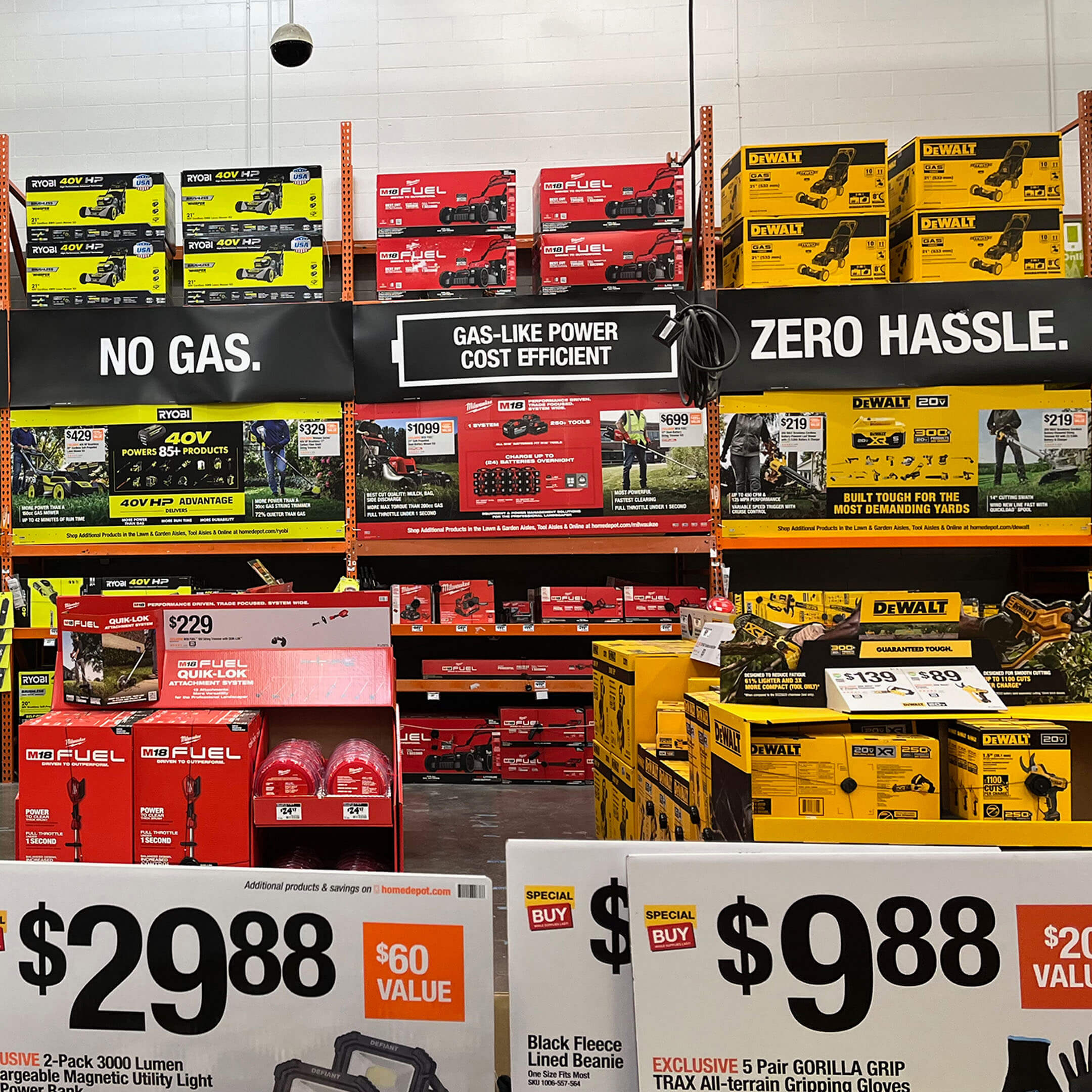
Stop. Marvel at how stores should be merchandised. Notice one thing missing? There is no “shop our expanded online assortment.” Just rows of superb packaging filling the shelves. Commanding attention. Connecting to the brand.
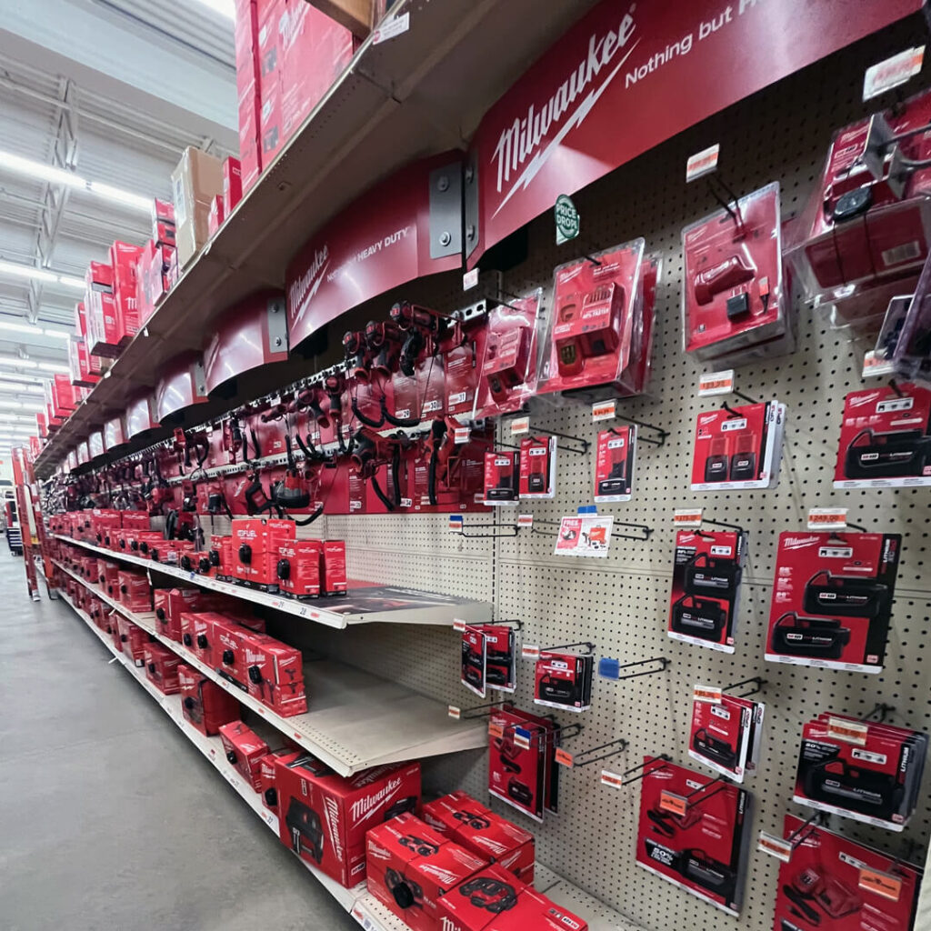
Across the aisle, the competition does the same. I know a lot of these fixtures are made for 8-foot displays. But let’s mix up the logo toppers. Give me a guarantee in the aisle. Provide reassurance.
Since all the products are in store, Fleet Farm makes it easy to locate, “order,” and pick your product. From aisle to kiosk to front of store!
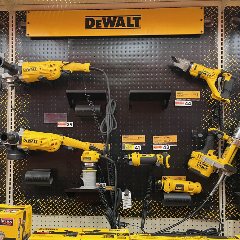
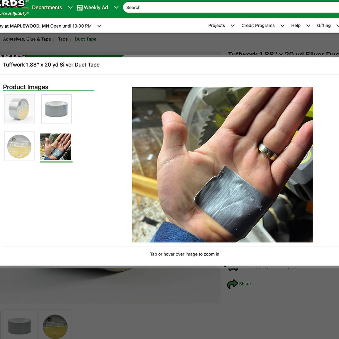
I’ve been looking for an 18GA Swivel Head Offset Shear! I can only find them online.
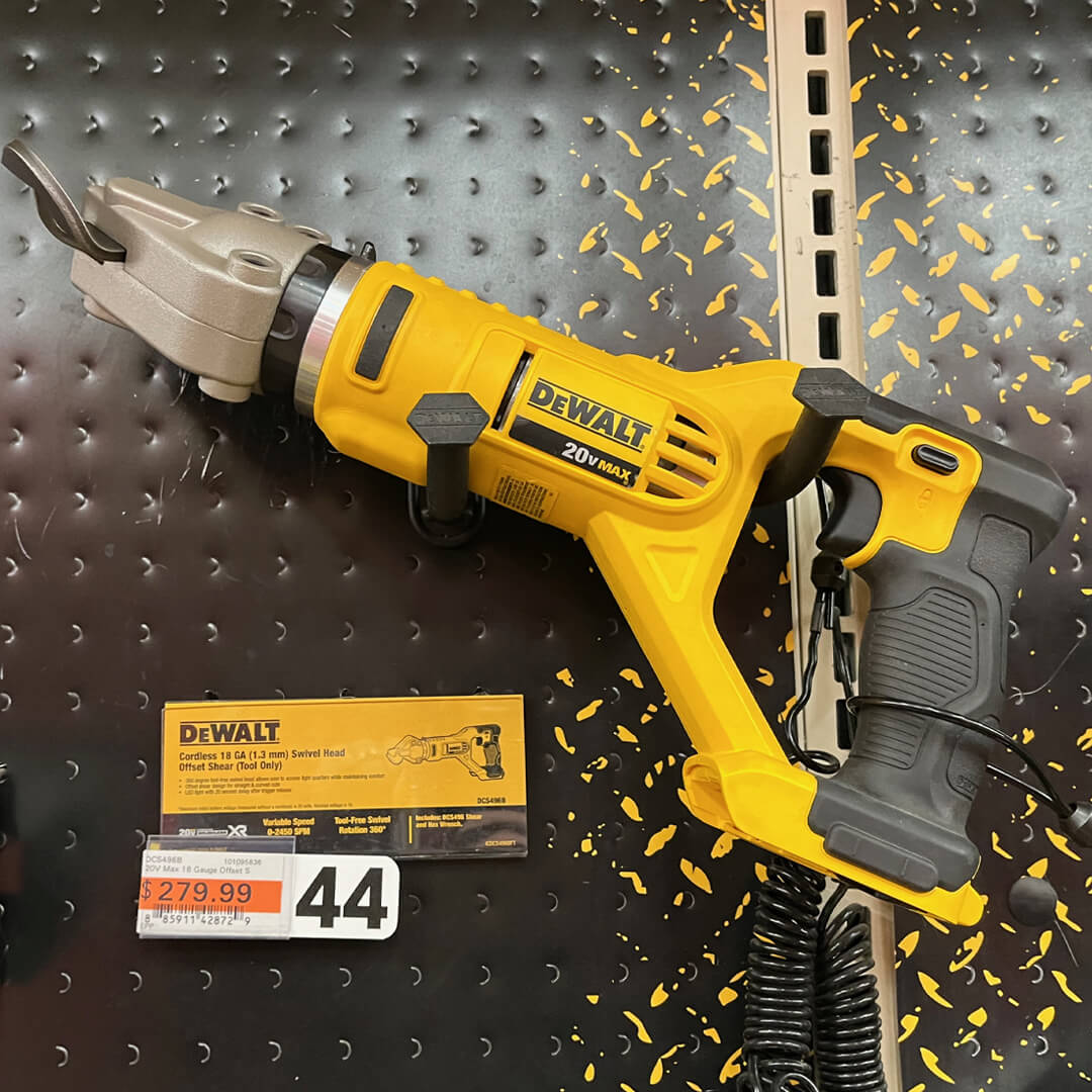
It’s number 44.
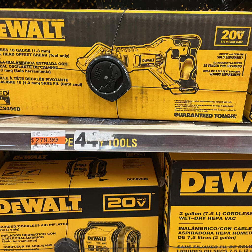
And it’s slotted in the correct number on the shelf. Frankly, this is the type of frictionless commerce I’m looking for.
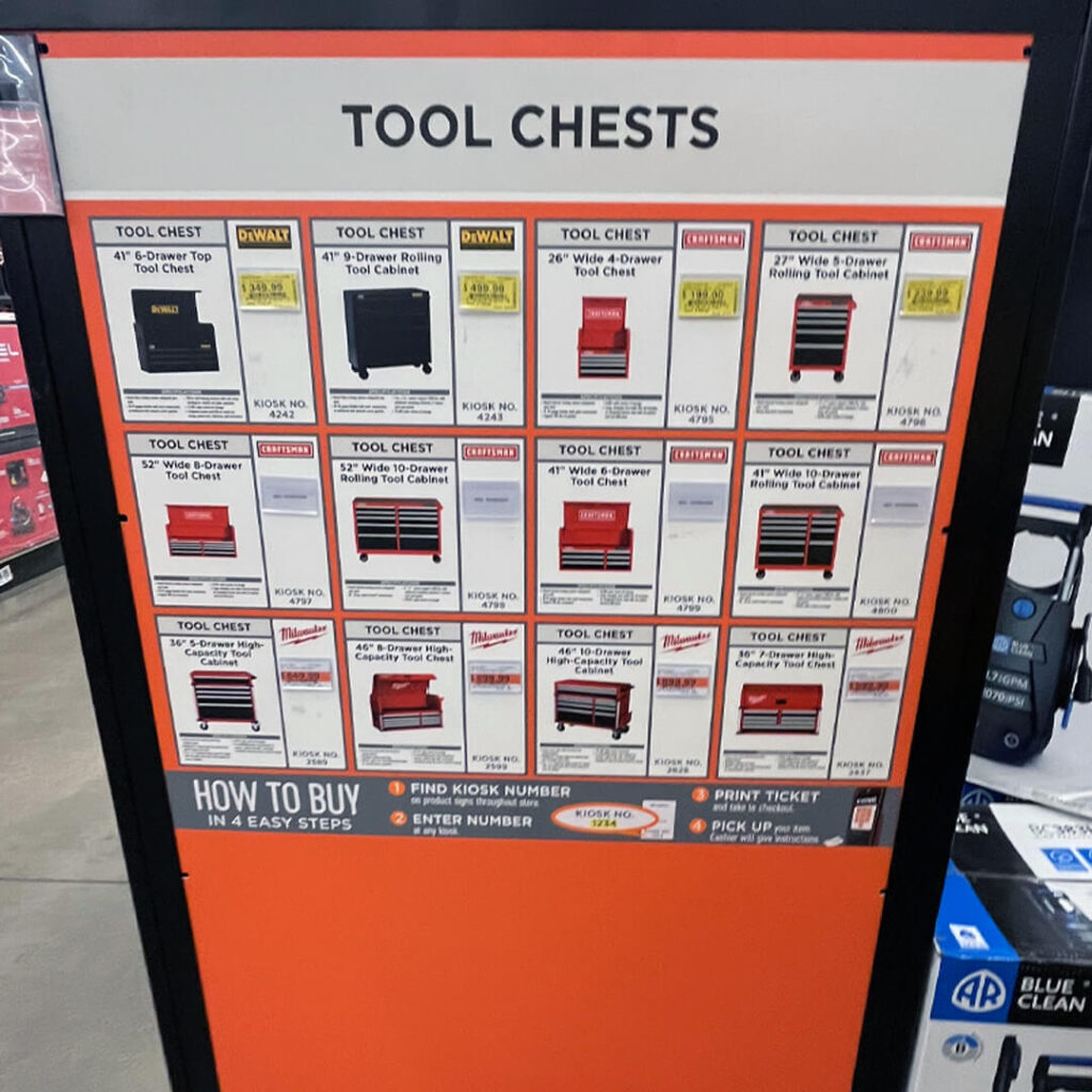
Need something big? No problem. Follow the “How To Buy” steps on the sign and head to a kiosk.
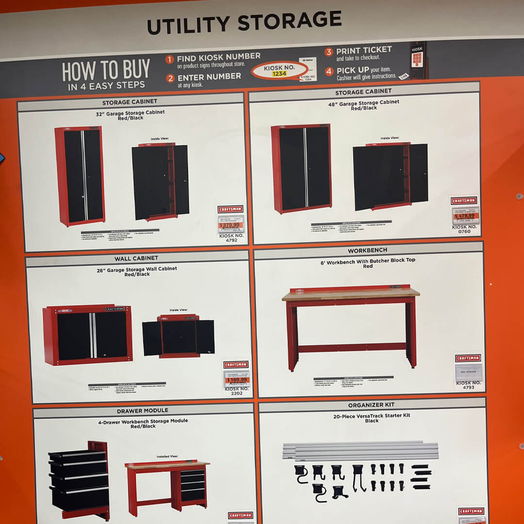
What, no QR codes? No need. It’s all here. Head to a kiosk. You don’t need to shop with your phone here!
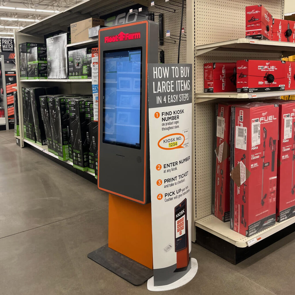
Enter the item number on a kiosk like this. Just print the ticket, and your goods will be ready after checkout.
Now let’s talk about the “Deal Days” sign we’ve seen throughout the event.
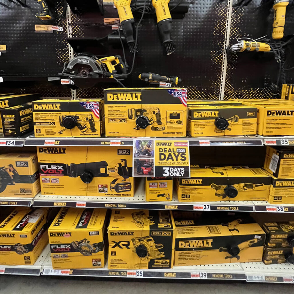
Tough to see it here. Sure the sign is the color of the lead brand, but it gets lost when displayed with the lead brand.
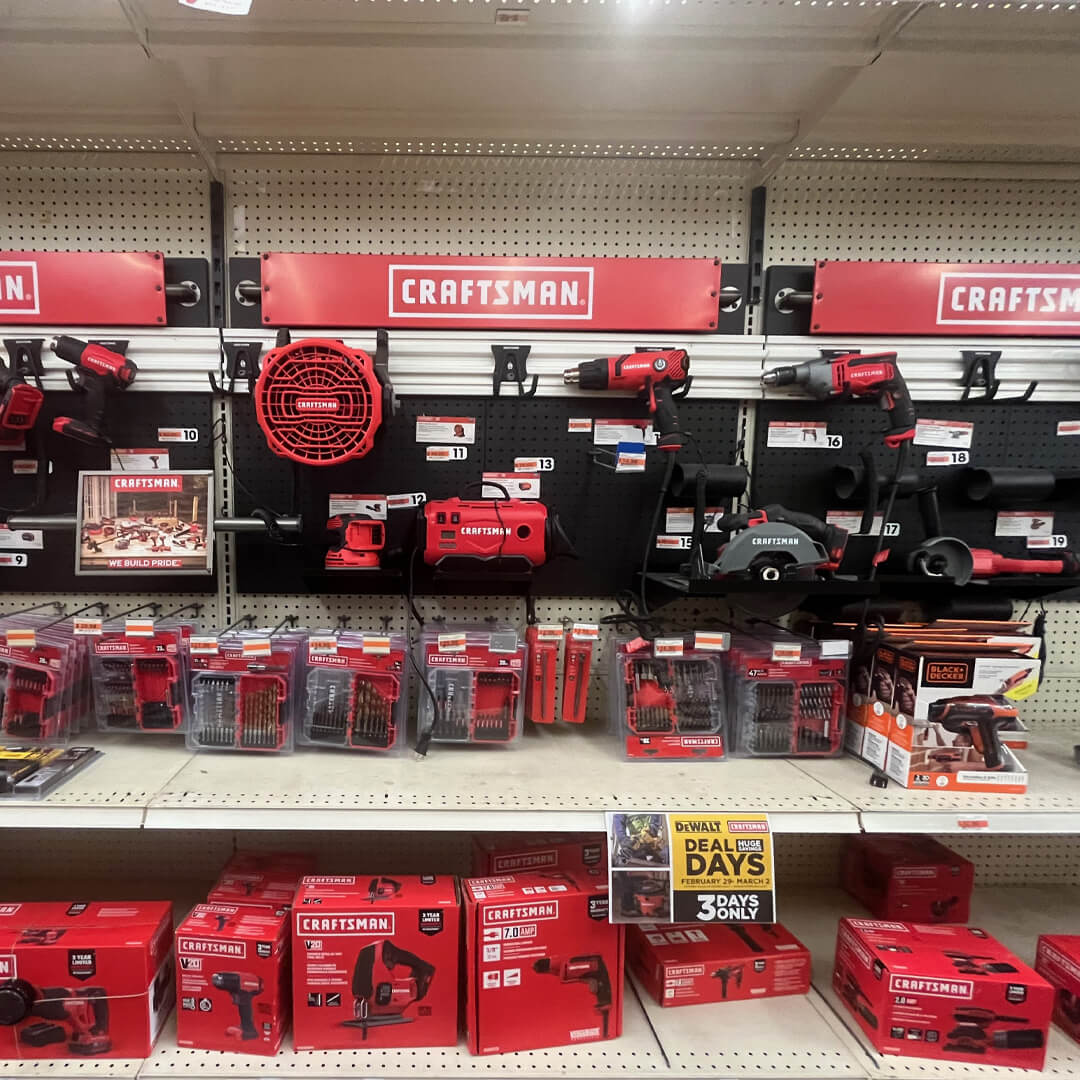
Great contrast here. Context is important. There’s only one way to discover context: Go to the store!
The competition also struggles. The challenge here is to deliver engaging temp signage that’s probably printed out at the store.
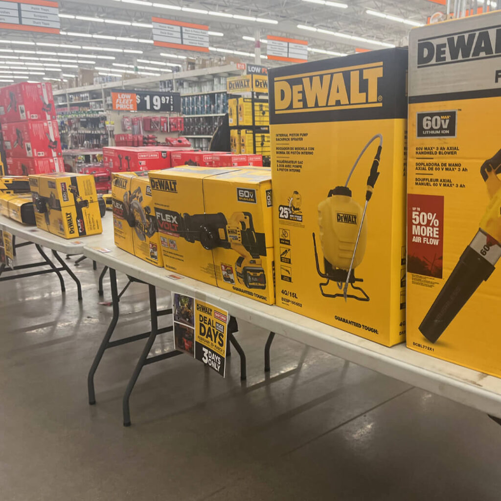
When it’s your only sign for the event, it should be seen. We call this “hiding in plain sight.” Go back and take a look. There’s one in nearly all DeWalt photos.
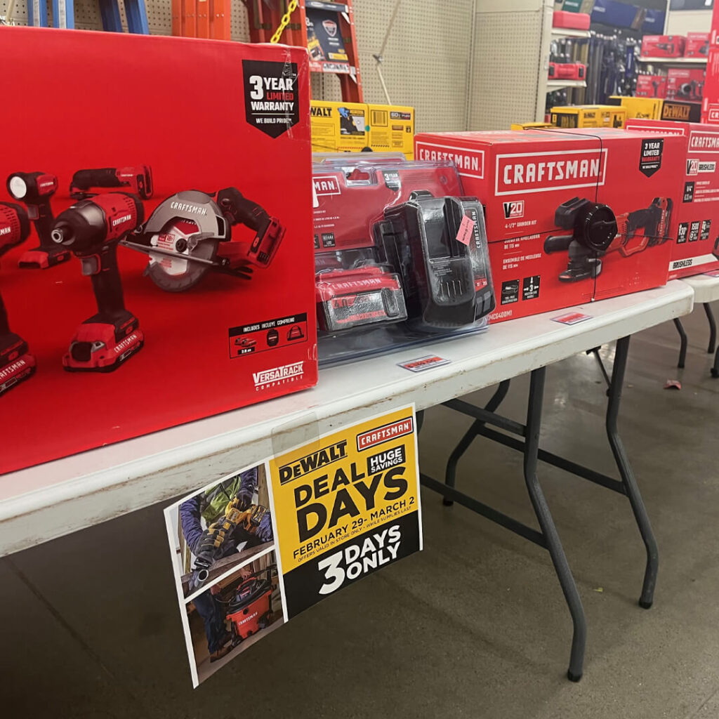
So, what’s the best color for this sign? It probably can’t be red because that’s Milwaukee’s color. Just black? Think context and contrast.
There’s more quality merchandising at Fleet Farm. Fixtures and products stocked properly on shelves create simple, branded experiences throughout the store.
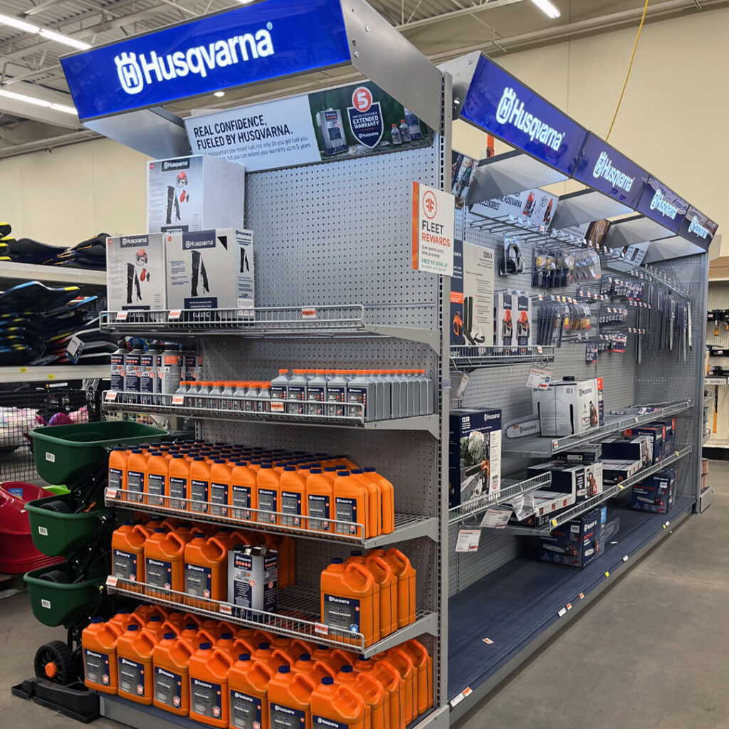
This Husqvarna aisle can also be seen at Lowe’s.
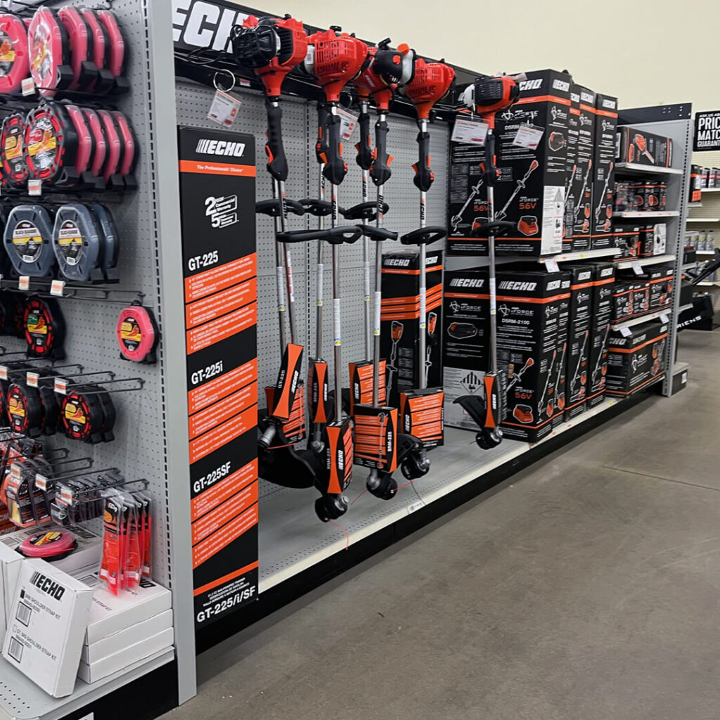
Less is more.
Now you be the judge.
Sure, this post was about a tool event. They’ve got a lot of tools at Fleet Farm. They’ve got quality brands at Fleet Farm: DeWalt, Craftsman, and Milwaukee. Great signposting, stocked packaging, and easy-to-find and buy products make it an excellent experience in-store. Yes, we critiqued a sign, but that’s a minor criticism.
Frictionless shopping refers to a customer experience that is smooth, effortless, and hassle-free. It eliminates any obstacles that might prevent a customer from making a purchase. Retailers use different tactics to decrease “friction” and have created “endless aisles” to scroll on our phones. But what if the “expanded online assortment” is a barrier to selection? What if the QR code to product reviews leads to more questions than conversions? What if all that in-store advertising for retailers’ website events and “online only” savings create friction?
At Fleet Farm, what’s on the website is at the store. When you get to the store, you shop, find your product, and check out. There are no obstacles. There is no second-guessing, “I wonder if there’s a better deal online” or “Is there another model online?” Fleet Farm is a smooth, effortless, and hassle-free shopping experience. Fleet Farm’s only friction is the rubber hitting the road to drive there.
See you at the store!
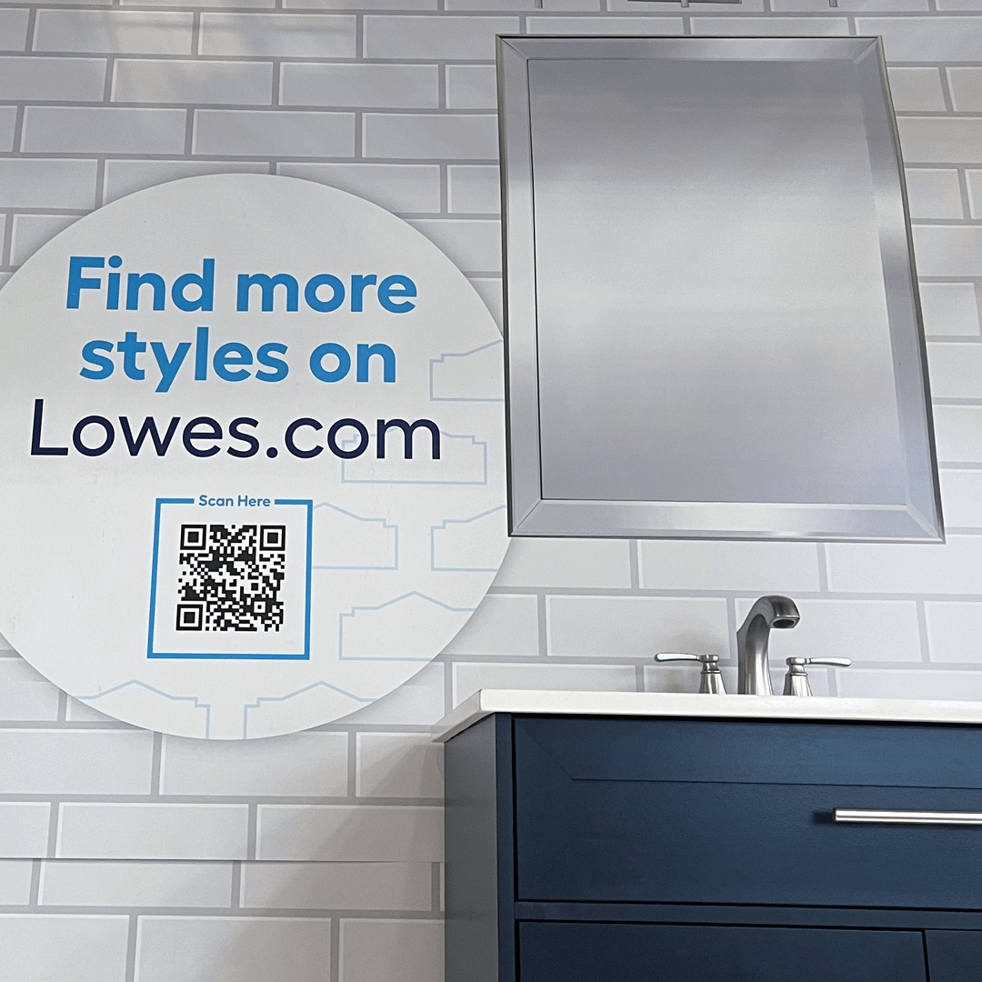
Is this hassle-free and effortless?
Make less friction for shoppers. Give them the reassurance to buy now and not a reason to look at the “expanded selection online.” I’m here to help.

