And, why that’s OK for a home improvement store.
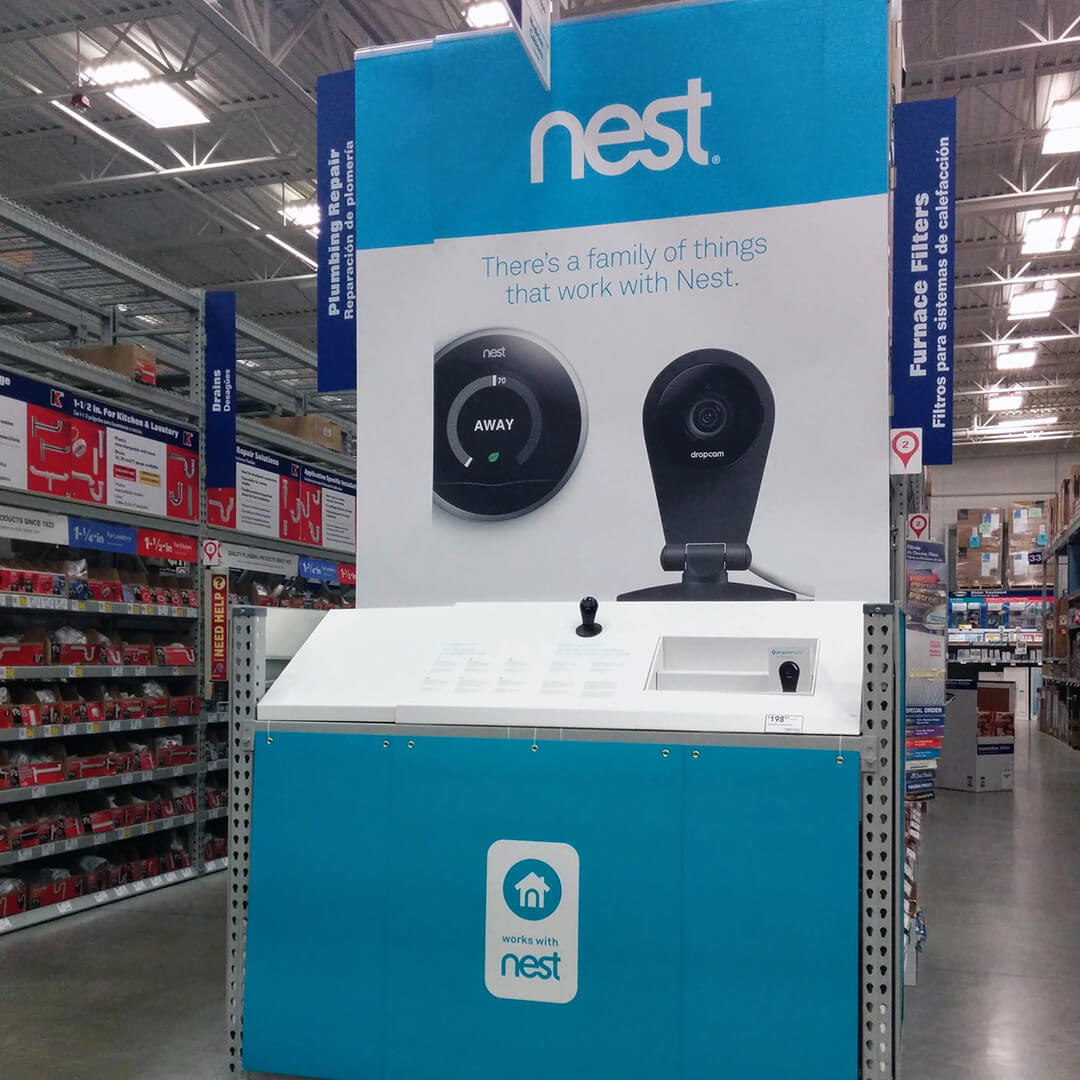
The image at the very top was taken yesterday at Home Depot. The Nest image directly above was taken in 2014. Besides more products in more places, the smart home strategy inside home improvement stores hasn’t changed much.
My Google Home app lists four cameras, 28 lights, three wifi devices, three plugs, switches, screens, door sensors, motion sensors, a sync box, and a climate device. I’ve been doing this for a while. Some of it makes a 1904 farmhouse run more efficiently, but most is for fun. And Yes, it’s been set up and reset a few times. It’s on Google and Home Kit, so the whole family can use it regardless of their preferred platform. I consider ourselves early smart home adaptors.
Go to any Best Buy, and the front of the store is set up with branded connected home sections: Google, Alexa, Arlo, Hue, SmartThings, and more. They’re all set up working together. It’s pretty awesome, but that’s solution selling at an electronics store. Home improvement stores are different. Consider the reason you make a trip to a home improvement store. I bet 85% of the time, you’re going there to replace something. You’re on a task trip to replace a light bulb or switch, doorbell, door lock, thermostat, or faucet. Home improvement stores know that, so all their smart home products are top-tier products in their categories. They’re labeled Smart Home.
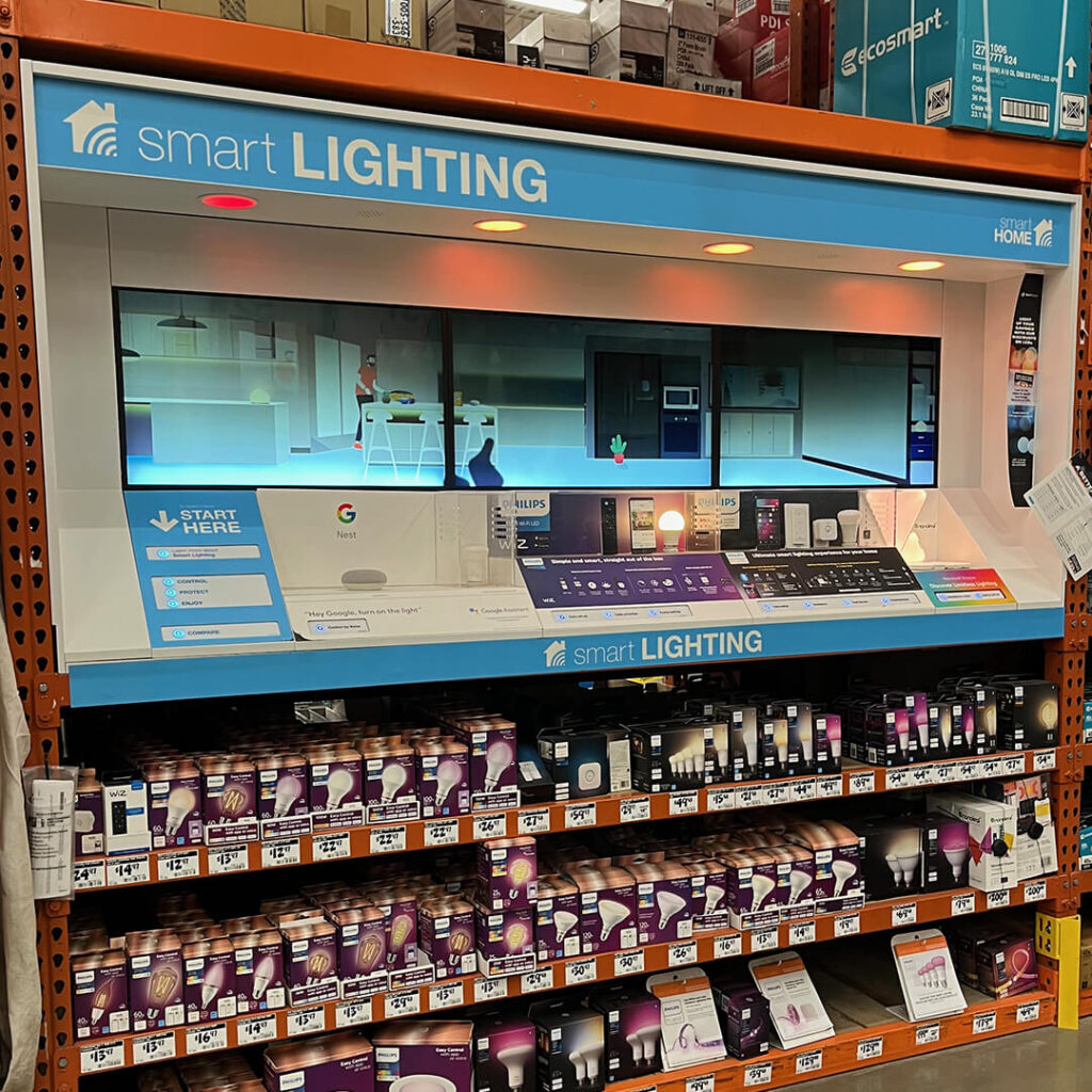
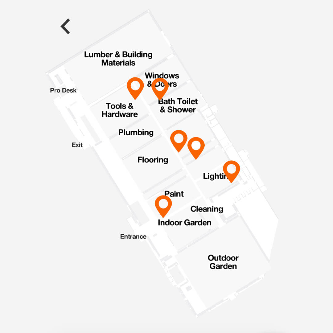
Hey, this lighting display is new! It’s got a cool three-panel display screen. This is the front of the store too. Now, I just have to look for that “Smart” logo throughout the store.
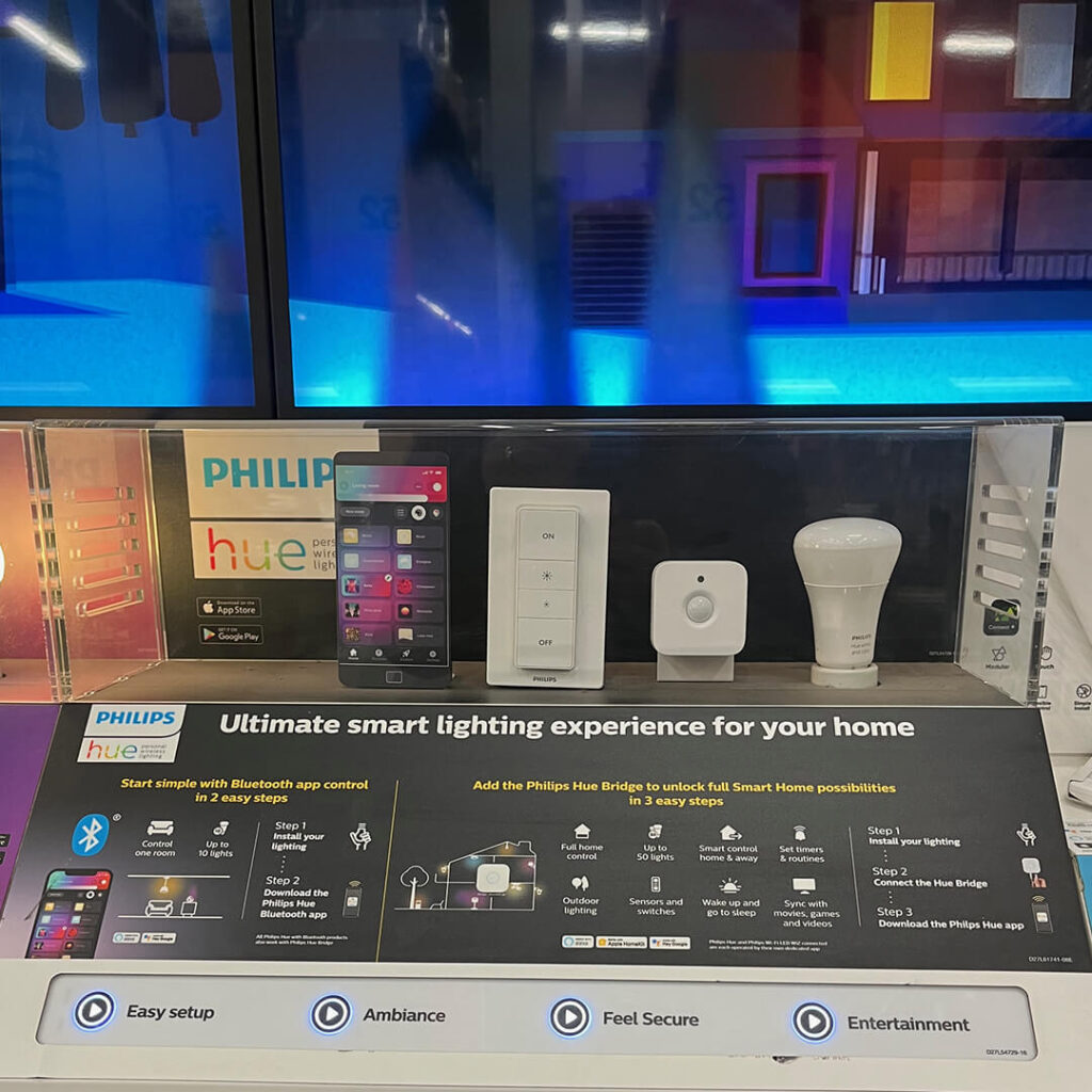
Start with a Hue light kit. If you are new to Smart Home, this is a great way to start. Old house? Those switch accessories come in handy.
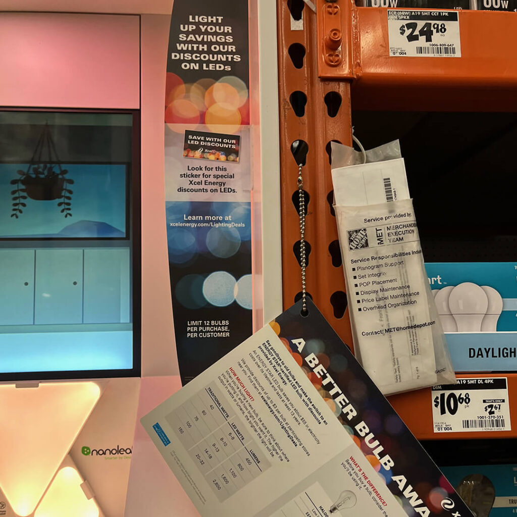
Be prepared for your merchandising to get cluttered. The team and vendors worked together to make an informative display at the front of the store; please don’t hang stuff in front of it. Plus, aren’t LED lights standard now? Do I have to know about energy savings?
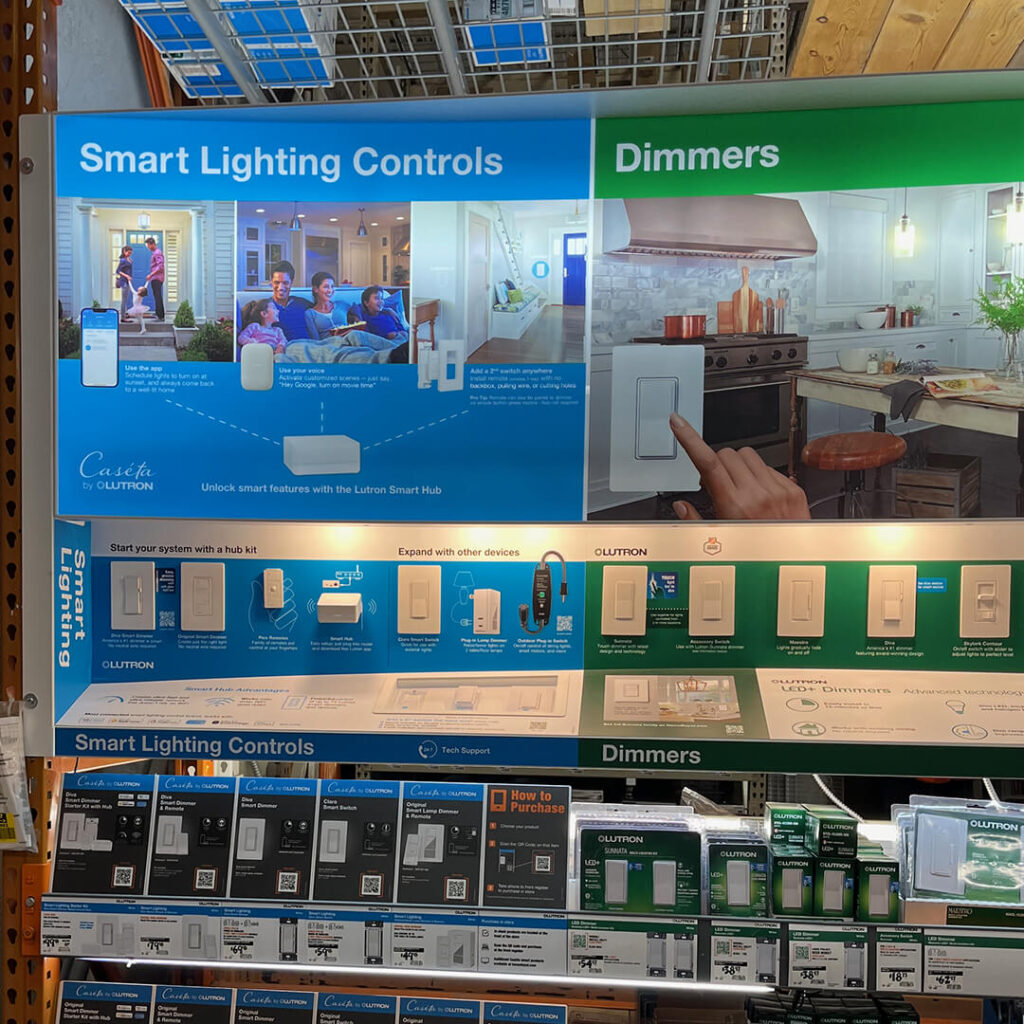
In the light switch section, the Smart products are called out clearly.
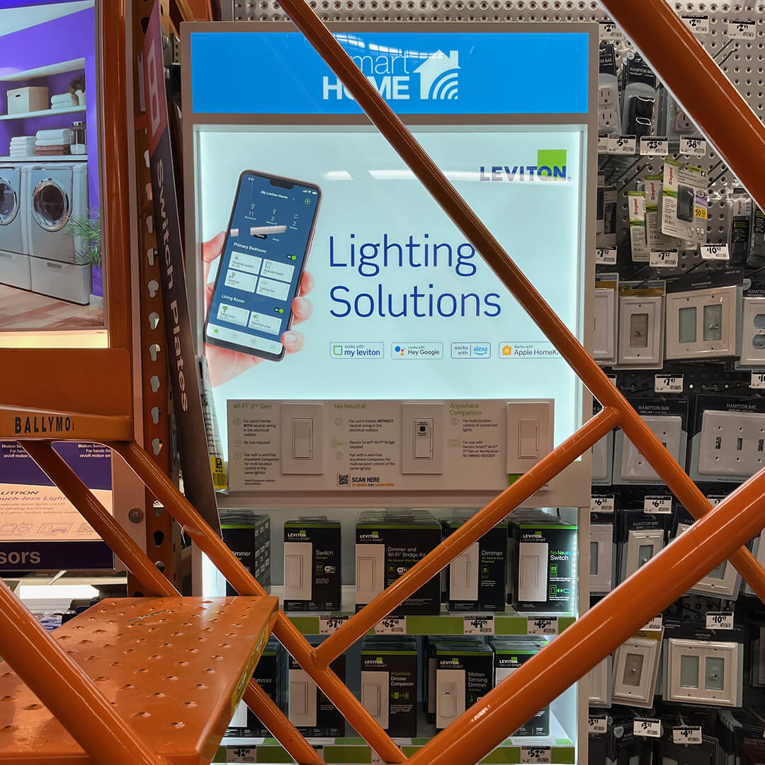
There’s nothing like a barrier in front of the $50 light switches. Great display. See the Smart Home logo!
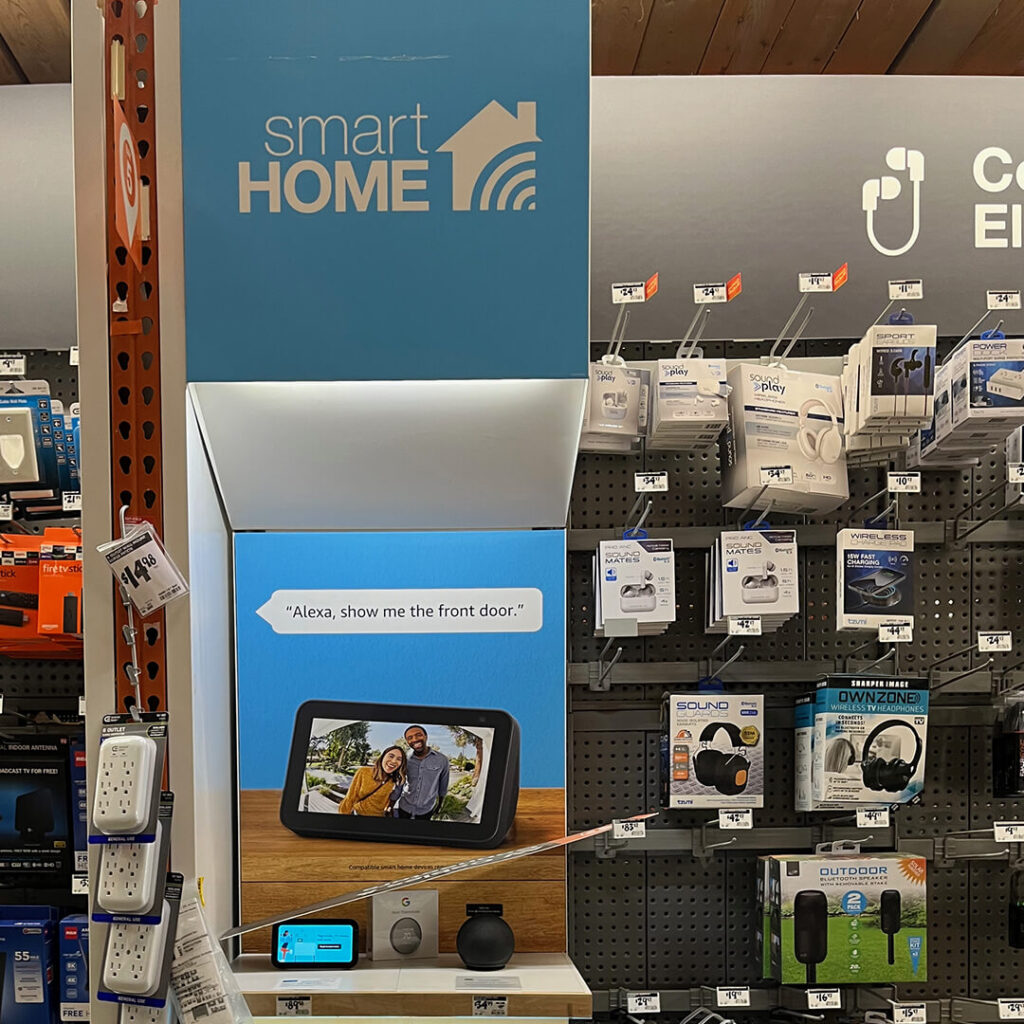
Another Smart Home logo is right across from all those switches. The switch and electrical aisle could have the most Smart products in the store.
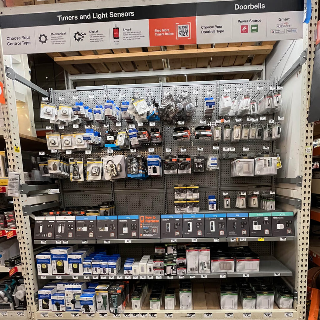
Doorbells is a little behind. While there is a “Hubspace” logo up in the corner, this section doesn’t have the “Smart” logo callout like the others.
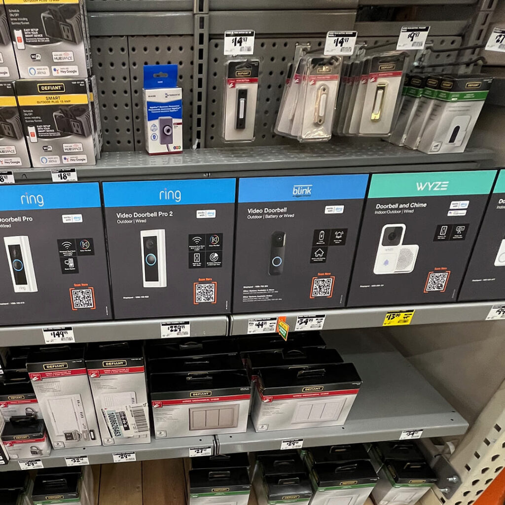
These product cards are used on shelves for most of the smart home products. No locks. Just pick or scan and get your product at checkout.
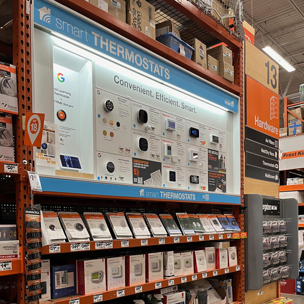
Smart thermostats are clearly marked, but who is going to read all that small copy up there?
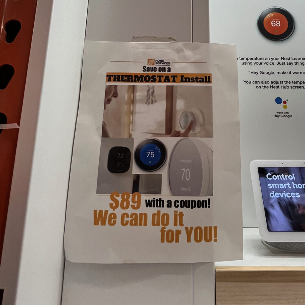
Installation services are adjacent to thermostats. Nice work!
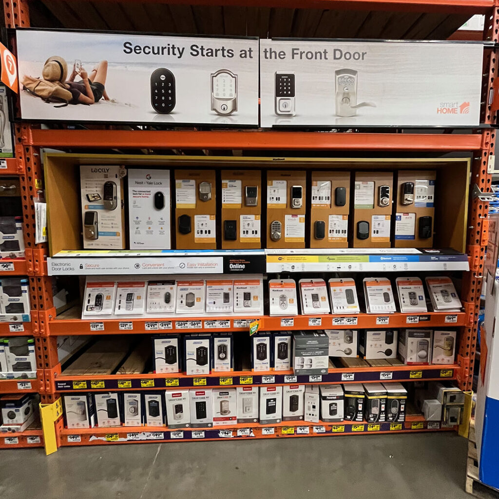
Door locks are the same. Hey, great consistency throughout the store.
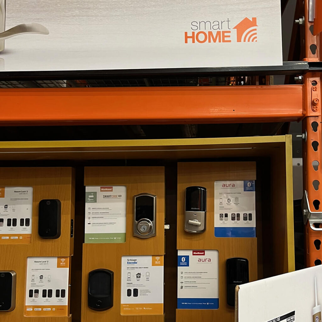
There’s the “Smart Home” logo at The Home Depot. Is this the only orange one?
At HomeDepot.com, the experience is a bit more bifurcated. It’s easy to find products, and there’s no “We’re the smart home experts” over-promise.
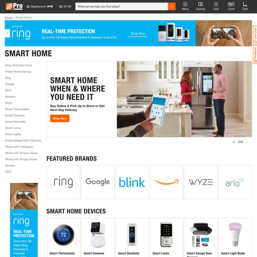
Smart Home Category page on the Home Depot website. Your one-stop-shop to find everything you need.
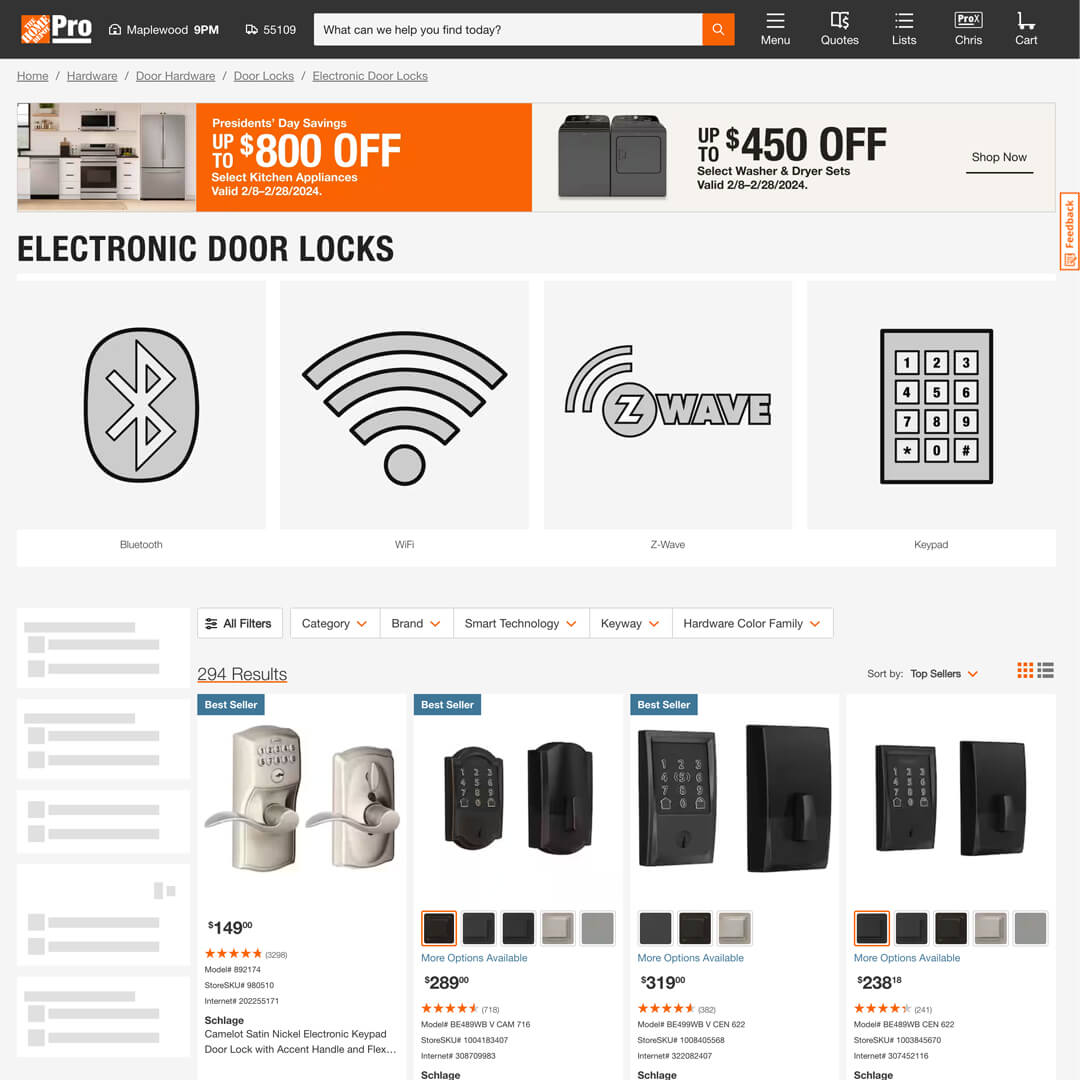
Subcategory pages are inconsistent.
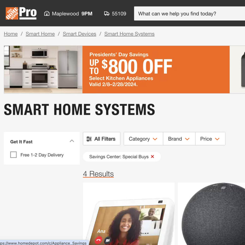
Hey, where’s that logo I saw in-store? I don’t see it anywhere online.
Now you be the judge.
Smart home product placement at the home improvement stores is based on the task. It’s based on replacing bulbs, switches, thermostats, and locks. Considering most people are heading to these stores to replace broken bulbs, switches, thermostats, and locks, it’s a perfect strategy for the channel.
But I had to walk around the store to see all that stuff. Thankfully, Home Depot does a great job of identifying “smart” products and sections with a logo. What do they do at Lowe’s or Menards? Go check it out and report back to me
Where’s the opportunity here? Using the Smart Home logo online would be a great start. In-store? It would be cool if they moved all that smart stuff to the lightbulb aisle. They’ve got all the screens there. It’s near the entrance to the store. It’s time to maximize that space; let’s keep an eye on it.
See you at the store!
The Smart Home Store Tour
Do you have a retail opportunity that needs to be maximized to its full potential? Contact me.

